PRANK-O WEBSITE
UI/UX Design
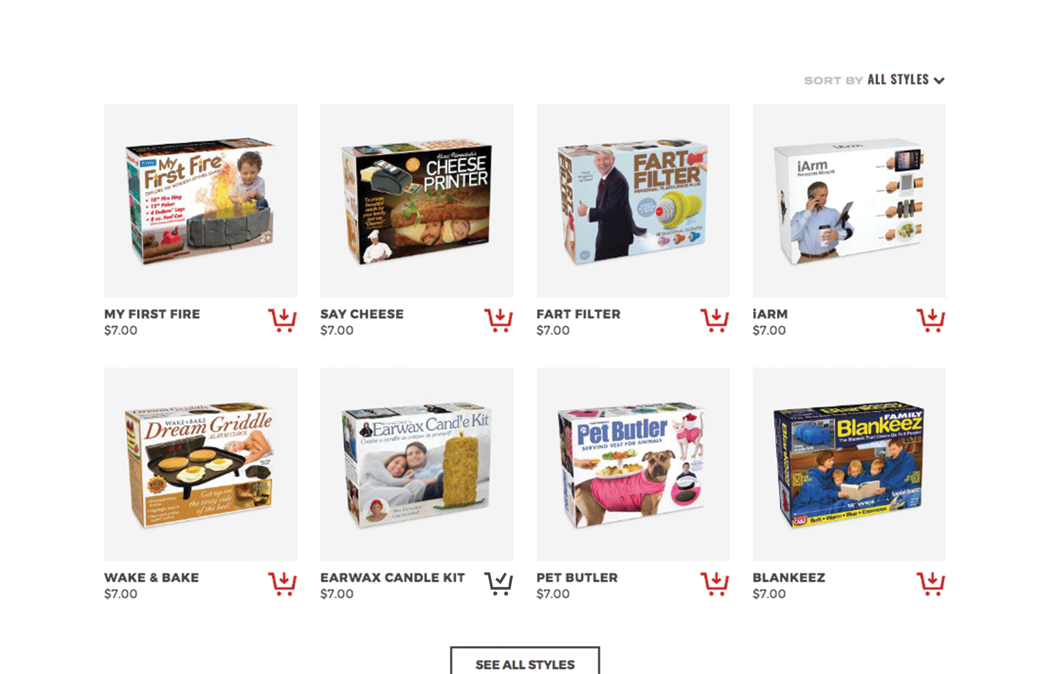
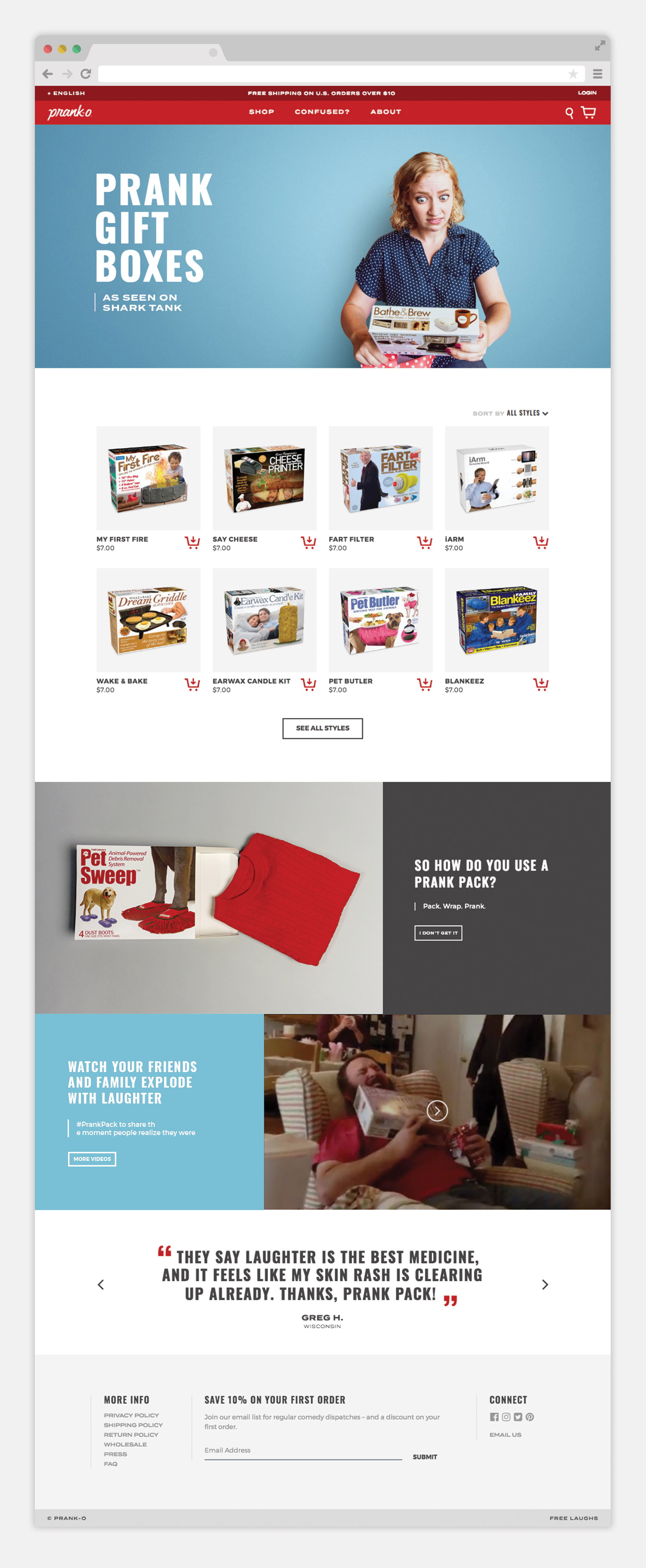
Before launching on Shark Tank, Prank-O was in need of a website redesign to increase understanding of their hilariously confusing product, prank gift boxes. By simplifying the messaging and structure, we aimed to increase conversion and entertain the customer.
CREDITS
MY ROLE: Lead UI, UX, & Visual Designer
—
PHIL JONES: Creative Director, Photographer, Designer
ARIK NORDBY: Designer
KLA HAECK: Development
—
Designed at 30 Watt

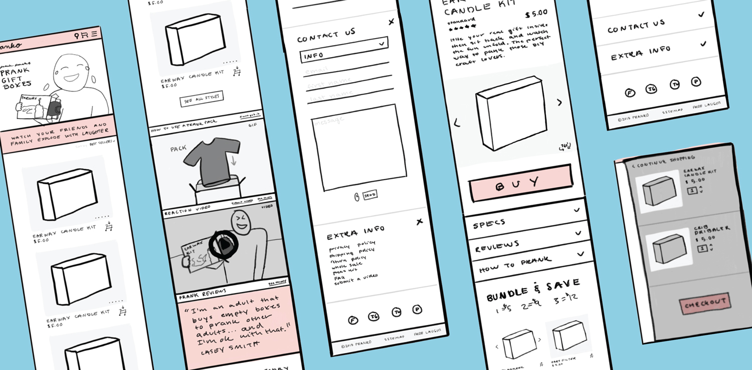
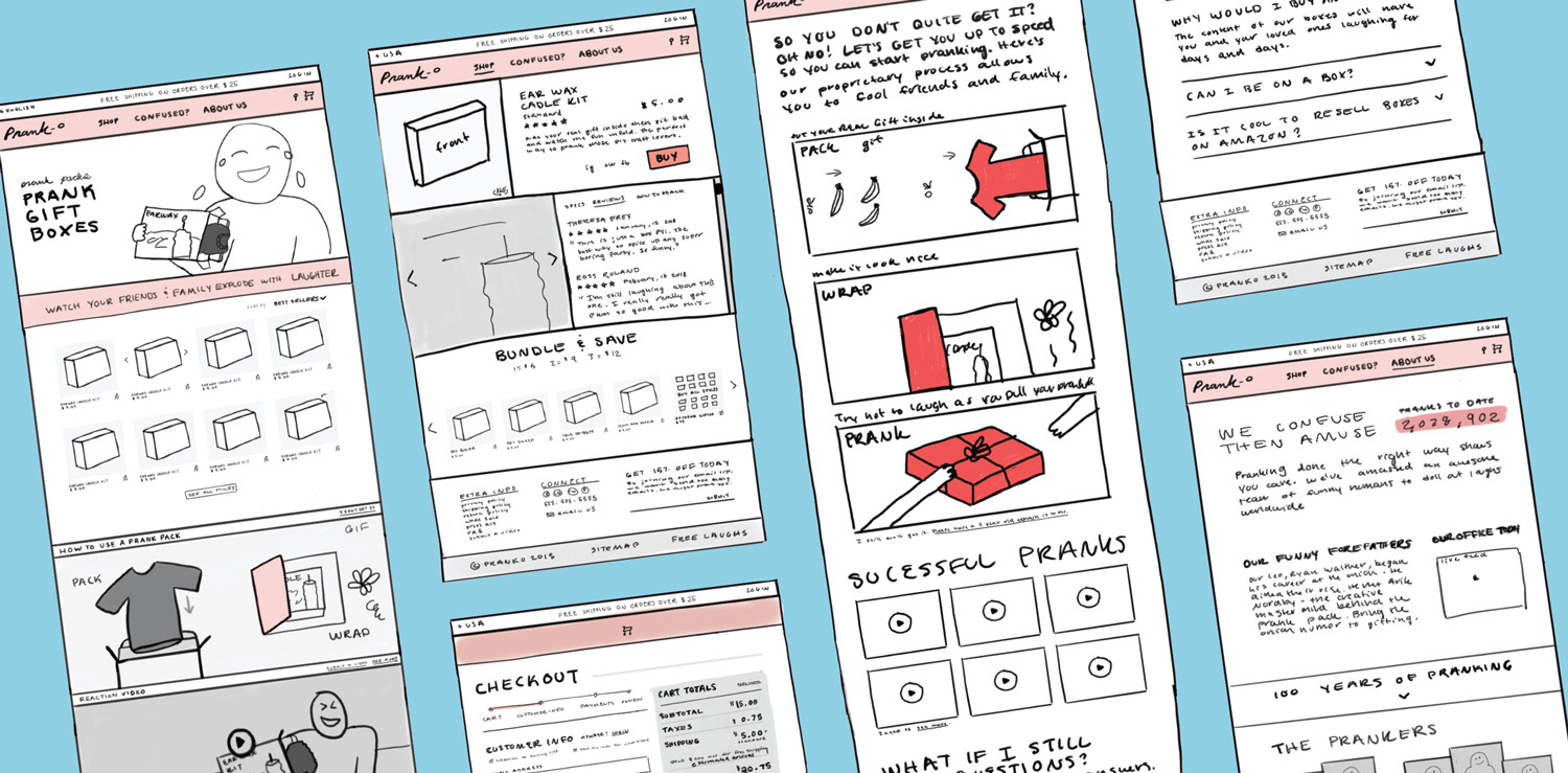
SITE MAP & WIRE FRAMES

DESIGN ELEMENTS


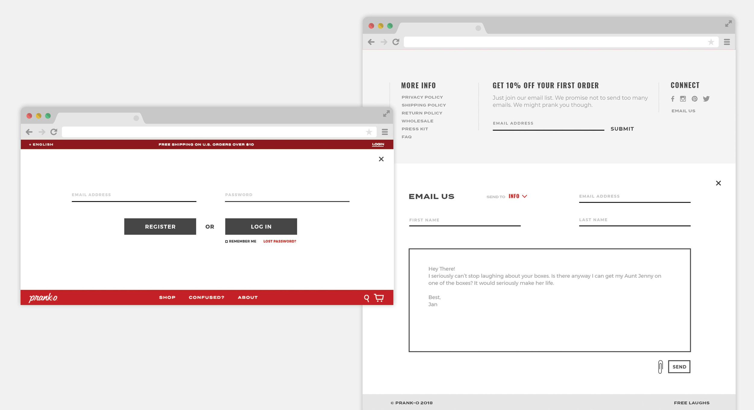
The two sections of the header slide open for the customer login. The two sections of the footer slide open revealing an email form.
Products can be sorted and added to the cart from the homepage. To entertain and encourage more clicking, a whoopee cushion also flies out when an item is added to the quick cart.